MA// BLOG
FROM CLASSICS TO CONTENDERS: ARE NEW CLUB KITS LIVING UP TO FOOTBALL’S MOST ICONIC SHIRTS?
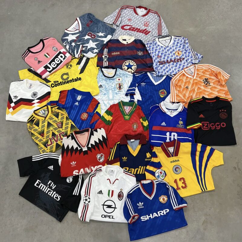
Some football shirts are more than just kits. They’re time machines. Cultural artefacts. The smell of Sunday league mud and Deep Heat in cotton form. Think of that Man City away shirt worn by Noel and Liam, with the word “brother” printed across it like a Britpop battle cry. Think of the intricate sponsor-laden masterpieces from Serie A in the ’90s, Batistuta in a Fiorentina shirt with Nintendo on the front, or Del Piero in Juventus’s pink away top. Closer to home, there was Cantona in that rope-laced 1992-94 United kit. Leeds in anything with Strongbow across the chest: a match made in West Yorkshire heaven. These weren’t just shirts. They were identity, stitched in polyester and pride.
And now, as clubs begin to unveil their 2025-26 strips with the usual slow-drip reveals, sponsored hashtags and CGI-led hype reels, the obvious question resurfaces: do the new kits live up to the classics?
Too often, the answer is no. Modern kits tend to hover awkwardly between soulless and try-hard — corporate minimalism forced
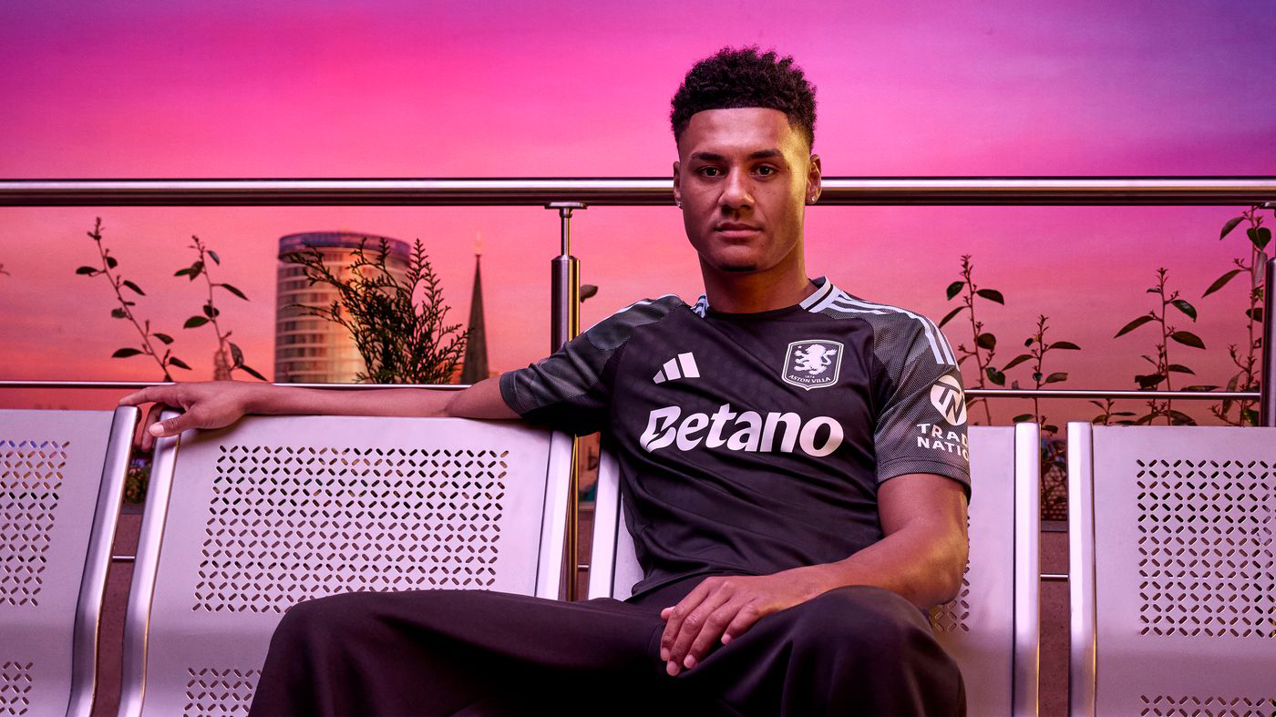
to wear the costume of ‘heritage’. There’s a growing trend for forced local references, kits with backstories crafted more for press releases than for the terraces. Aston Villa’s black away shirt this year is a good example: a tribute to Birmingham’s Bullring shopping centre. Fair enough, but it feels more like a Debenhams staff uniform than a football kit. Brighton’s turquoise trim, a nod to the seafront railings, suffers a similar fate. These references sound nice in theory but often come across as design-by-Google.
The dominance of the big manufacturers hasn’t helped. Nike and Adidas, in particular, continue to apply the rinse-and-repeat approach: one idea followed by a dozen cookie-cutter imitations. The uniformity is especially noticeable when you flick through kits across the leagues: barely differentiated shapes and sleeves, save for a new neckline here or a pattern in a slightly moodier grey. There’s nothing wrong with simplicity, but we’ve long since moved beyond artful minimalism and are now talking about flatpack design.
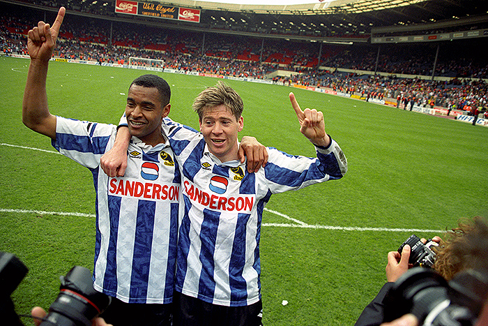
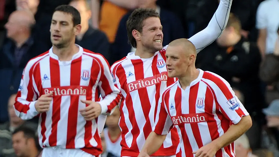
What gets lost in this templated rush is the individuality. Because a great shirt doesn’t just blend in. It has something that sets it apart. That’s what you got with Stoke City’s bold red-and-white tops from the mid-2000s, complete with Britannia sponsorship. Or Sheffield Wednesday in their old Sanderson kits, which somehow made a domestic appliance company feel like part of the club’s soul. Even Sheffield United’s Laver shirts had something gloriously local about them. Compare that with many modern Championship or League One kits today: solid, yes, but increasingly blank-faced under gambling ads, soulless motifs and off-brand sponsors whose logo you’ve never seen anywhere else.
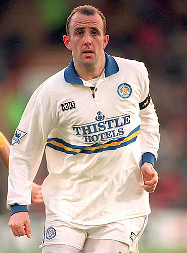
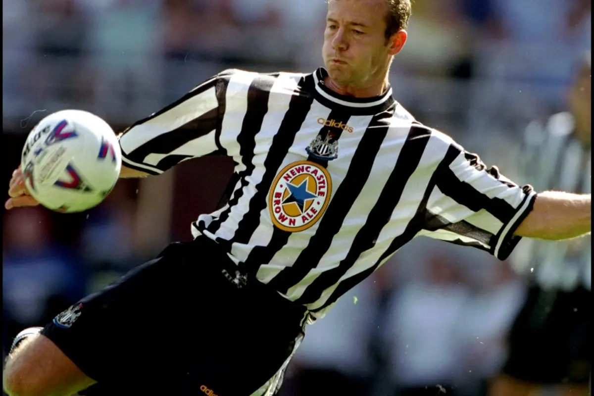
Sponsors used to say something. Newcastle Brown Ale on the Toon shirt was geography and identity in one. Leeds went from Topman to Strongbow to Thistle Hotels, all of which felt like parts of the wider city, the nightlife, the swagger. Now? Leeds wear Red Bull. Not Red Bull as a logo. Red Bull as an entire club identity. It doesn’t look bad. It’s just utterly, shamelessly corporate. Hard to imagine anyone keeping the shirt as a memento in ten years unless they’re collecting global franchises.
That’s not to say good modern kits don’t exist. Newcastle’s new third shirt — a deep navy with green and gold trim, a retro badge, and the Adidas Originals logo — is a rare beauty. It’s clearly a nod to their iconic 1997-98 away shirt. But even then, the effect is a little undermined by the Sela sponsorship, which feels like a corporate watermark on what could have been a classic. And across the board, it’s often the sponsors — not the designs — that kill the mood. West Ham’s kit this year has that tidy claret and blue design you’d expect, but BoyleSports lumbers across it like a bad tattoo, with nothing on the eastenders’ Dr Martens days, or the time their shirts were made by Pony (which was even better if you knew what it meant in Cockney).
On the flip side, Chelsea’s choice to not have a shirt sponsor for the second season in a row is quietly radical. In an era where every inch of fabric is monetised, there’s something refreshing about that clean, badge-and-brand-only aesthetic. It’s unusual for the Premier League, but it also harks back to an earlier era, when football shirts were first becoming fashion items, before they were billboards.
Looking for vintage, retro, or past season football shirts? We recommend heading to classicfootballshirts.co.uk or visit Classic Football Shirts on Dale Street in Manchester or Commercial St, London for the ultimate collection.