
MA// BLOG
T95 x Marshall Artist – Best and worst World Cup Logos
There’s a reason an image of the actual World Cup Trophy’s never featured on an official tournament logo. Because it looks shite. Tacky. A bit cheap. And that’s being kind. Safe to say, then, we’re not fans of the 2026 World Cup official logo. Nahh. Which also depicts the year the tournament’s being hosted. Another first. It looks a bit of an AI job. Almost word-arty. Probably not, mind. Probably spent thousands, if not millions, getting some wanky PR agency to design it. There’s a load of high performance podcast spiel to go with it too. How its identity can change and reflect the uniqueness of each host country. Wouldn’t be surprised if owd Donald Trump’s designed it on his Etch A Sketch. Or Paint. Looks dog shit mate. Hopefully the tournament itself is better than the logo, otherwise we’re in for a stinker.
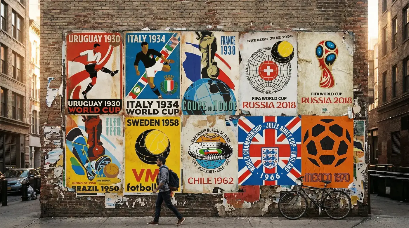
They’ve not always been this bad, though. In fact there’s been some belters over the years. The first four World Cups, Uruguay 1930, Italy 1934, France 1938 and Brazil 1950 all featured posters rather than logos. All unique. You’ll have seen ‘em. Proper art. Proper cultured. Ya barber’s probably got one on’t wall. Bagged a print on Etsy. He’s buzzing with it. I would be and all, to be fair. They’re a bit abstract. All have something about ‘em. Can imagine ‘em in a gallery or an exhibition or somet’.
Ahead of the 1954 World Cup in Switzerland FIFA changed tact, and handed creative control to each host country. Allowing them to create their own visual identity. A gamble, perhaps. Risky. But it produced some eye-catching designs. Maybe not for the right reasons, but they’re different, at least. That Switzerland one, for example. I’m not sure what it is, but it screams ‘Ministry Of Sound’. Obviously they weren’t listening to Basement Jaxx, Moby or Darude back then. But that’s where my mind instantly goes. Maybe it was the other way round. The designer of the Ministry Of Sound logo was a massive fan of Switzerland 1954. Who knows. Either way, it’s a bit meh. Similarly Sweden 1958. It’s pretty forgettable. Chile 1962’s got a bit more about it featuring the country’s national stadium, Estadio Nacional Julio Martínez Prádanos, but it’s far from a classic.
England 1966 was the last tournament which saw the host country have full control over its logo. And to be honest, it was for the best. The FA signed off on something that resembled more a flag than a logo. A ball, trophy and England’s Three Lions were positioned on top of a Union Jack background. A bit of a mess, really. Too much going on. Which is a shame, because it had potential. It’s almost like they spent too much time designing an iconic mascot, World Cup Willie, and completely forgot they had a logo to sort too. Last minute job, and annoyingly, a bit predictable.
Four years later FIFA took back creative freedom and adopted a much cleaner, less is more style resulting in some of the most iconic World Cup logo designs ever produced. Mexico 1970 was the benchmark. It set the standards for the next seven tournaments, and whilst they might not have always hit the same heights they delivered. The pentagons of the Adidas Telstar featured alongside ‘Mexico 70’ in what would later become one of sport’s most iconic typefaces. If you read Mundial
Mag, you’ll know the one. Stylized, geometric lines. A direct continuation of the font and identity developed for the Olympics two years prior, also held in Mexico.
Now i’m jumping the gun here. But Mexico had to do it all again 16 years later after Colombia stepped down from hosting the 1986 World Cup. And they had a lot to live up to. It was going to take something special to surpass Mexico 70. Like a one hit wonder looking to drop another banger. It’s not easy. The pressure’s high. And, if i’m being honest, it didn’t quite hit the mark. It was a bit chaotic. For me, West Germany 1974 and Argentina 1978 are just alright. They’re unique. Simple. But pretty boring. Can probably chuck Espana 1982 in there too. It’s a bit lazy. Uninspiring. Like they’ve got the work experience kid to sort it. A football and the Spanish flag. “That’ll do, won’t it?” Fair play.
Design. Coffee. Cars. Suits. Food. The Italians know what they’re doing with it all. They’re all good looking bastards too. And smell mint. Not that that has anything to do with designing a logo for the World Cup. But there’s got to be a link. They’re just on it. And they were bang on the money with Italia 90’s identity. It’s probably top two World Cup logos of all time. And the most significant. The most iconic. The most recognisable still to this day. The Italian tricolours were used to create a three dimensional football, and a stencil typeface created real depth. I know that sounds proper wanky, but you get what I mean.
The United States of America had the impossible task of following Italia 90. And ya know what, it was decent. Much better than their attempt this year. I’ve already vented about that. But USA 94 was solid. Clever. It’s simple, but effective with the ball shooting through the flag. The font’s a bit shit, but it still works. Top 5, probably.
This is the one for me. France 98. Maybe because it’s the first World Cup I fully remember. Michael Owen’s wonder goal. Beckham’s red card. Zidane dominating the final. Iconic. The logo as well. Apparently the ball represents the sun rising over the earth’s horizon. And there’s a nod to football being the world’s game. I’ll be honest, i’m 34 and i’ve never once thought either of those things when looking at it. I just think it looks mega. Can picture the logo on a shiny Panini sticker. The mascot too. Both class.
Korea and Japan 2002 was the first ever co-hosted World Cup, so it needed a logo that represented both nations. It’s a bit abstract. There’s a figure raising its arms, which i’d never noticed before. Probably because i’ve never bothered to look closely enough. I mean, why would I? It’s sound, though. One of the better ones. In fact, it goes down hill from there really. Germany 2006 is just weird. Apparently it’s about human connection, but it just looks like three Space Hoppers with smiling faces placed on top of the World Cup trophy. Not for me. South Africa 2010’s better. It makes more sense. It’s vibrant. And the figure shaping up for a bicycle kick is a nice touch. It’s the last truly unique World Cup logo, which is a shame really.
What’s followed in the past three tournaments, Brazil 2014, Russia 2018 and Qatar 2022 is a bit disappointing really. It’s like they can’t be arsed anymore. It’s a bit of a template job. Very safe. Very corporate. Which is a decent metaphor for the current state of football actually, but we’ll leave that for now, World Cup starts next week. Brazil 2014’s the best of the last three. It’s got a nice pop of colour. But that’s about it. There’s not much to say really about Russia and Qatar, other than they’re both a bit boring.